Andy Clymer
Recent Work
New Icon for DrawBot
![]()
DrawBot was conceived by Just van Rossum as a tool to teach the Python programming language to students in the Type&Media course in The Hague, where I studied in 2004. In the last five years or so, DrawBot’s development has been pushed forward by Frederik Berlaen, another Type&Media alumnus.
To oversimplify an explanation of how DrawBot works, the user writes lines of code to draw basic shapes and set text on a page or within a frame of an animation. Instead of clicking and dragging to make a rectangle, you would instead specify its X and Y starting position, width, and height in a line of code.
rect(x, y, width, height)
If you want to draw two rectangles or ten rectangles you can repeat the lines of code, or better yet, you can put the basic principles of the Python programming language to work and let it step-and-repeat the drawing instruction for you. Maybe in a different position and with a new color each time. These basic building blocks can result in something much more elaborate than a designer would considered to draw by hand, and makes it quick and easy to draw variations on the same design.
And, it leaves room open for chance. Some of the more interesting things I’ve made in DrawBot were by accident, like the time I was trying to use code to draw this —
And ended up with this amazing start of something new instead —
The lessons at Type&Media worked for me, I got along well enough with Python to continue with it and to enjoy using the language to make tools for type design, but whenever I have a chance I prefer to use DrawBot (at least as a starting point) over more traditional applications that a graphic designer might use.
Even in 2004 there were other tools available for designers and artists to make an image using code but they were directed more toward “interactive” work, drawing bitmap images for the screen. DrawBot offered something different that a print designer could appreciate — in DrawBot you’re drawing vector art directly into a PDF, and you have the ability to use the CMYK color space. A simple characteristic of the app, but a useful one! Because of this, DrawBot is great for making the first draft of a design that you can then open up in Illustrator to finish off. And while you’re at it, go ahead and set some of your variables to be “random” and have it build a dozen variations of your design for you to choose from.
In fact, the previous icon started from a prompt when I was in Just’s class back in 2004 — to design a new icon for DrawBot using only code. My result —
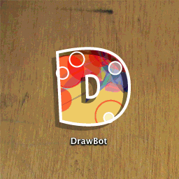
Most of what you see decorating the “D” icon comes from the pleasure of adding those “random” values to as many variables as possible, but having to think through how to plot the bezier points of the “D” without using a drawing tool also made for a good lesson.
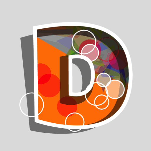
Later, in 2013, Frederik Berlaen used my icon as a starting point for a new one as he was making a substantial update to the app. The demo animation I made years before in class showed the icon changing randomly, only for the purpose of giving a sense for how much variation could be possible. But, somehow Frederik found a way to get the actual icon to animate in the dock. I challenge you to find another app that’s done this!
Here’s Frederik’s take on my icon, as it appeared in the appliaction —
Over the years DrawBot has grown into an incredibly useful tool, so much more than something to make a simple sketch of random shapes with. So, I thought it was time for a new icon and offered to make one.
I liked the depth of the original icon and I wanted to keep that, I was trying to make it look like this pile of random shapes and colors were living inside the app, but I thought the new icon could look better as a looping animation rather than a random jumble of “stuff”. Over a few sessions of programming and passing code and animations back and forth with Frederik, here’s what we came up with.
The first sketch —
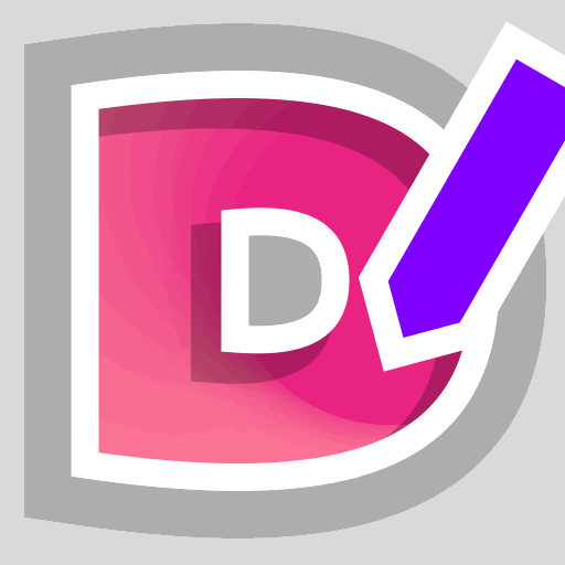
A little bit dizzying, but I liked it. I thought a lot about this pencil, wouldn’t it be nice if it rotated to look like someone was actually holding it? Maybe this is the path a hand would really take —
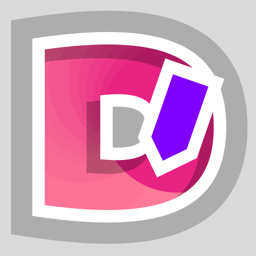
Actually, probably not, it doesn’t look very natural. But the movement helps! A little bit more work and I think I got the pencil rotation to look a lot better, even if the updated colors make it look like a Dunkin’ Donuts logo —
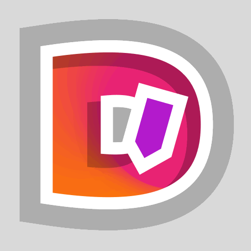
I still wanted to work a little bit more of a reference back in from the previous icon, so that it felt more like an upgrade and not a completely different app. I brought back in some of the color palette and the “random bubbles” from the older icon —
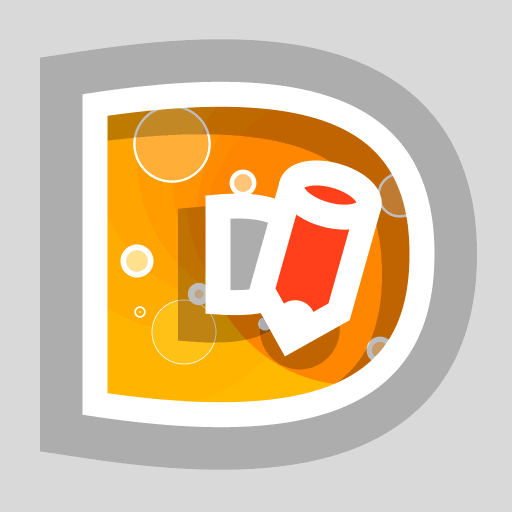
This time, I thought it was important to find a way to make the “bubbles” loop as they animate and not simply jump around randomly.
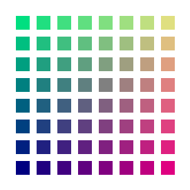
In the previous icon, each frame would draw them at a random size and in a random location —
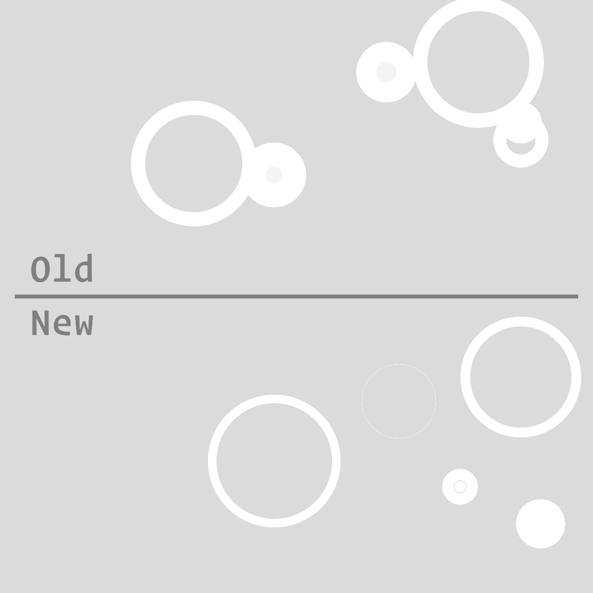
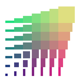
In the new icon they still start off with a random size and in a random location, but I came up with a way to make them stay in that position and grow with each frame. Instead of having the code draw them directly into the canvas with each frame, their position and size would be held aside in a list, where the size can be incremented with each frame but the position would stay the same. Then, with each new frame, their data from the list would be used to draw them within the letter.
And with a few final adjustments —
![]()
If you want to look further into it, I’d encourage you to try DrawBot — the full source code for the icon is available on DrawBot’s website.
DrawBot is much more than just an animation tool, and over time I’d like to share more projects where I’ve had an chance to utilize it. Aside from my work as a typeface developer I would also love to have an opportunity to continue to make tools for graphic designers in DrawBot — if you have a design problem that you’d like to talk through, please be in touch!
hello@andyclymer.com
![]()
— Andy Clymer
September, 2018